How To Read All Those Symbols On Your Beauty Products
It sounds so basic, right? If you can read a written language you can surely read beauty product packaging? And although that might be true for brand names and product titles, flip around any product in your bathroom and you’ll almost certainly see a collection of symbols that all mean different but rather important things.
These symbols show you key information at a quick glance, so it’s worth learning what these few simple logos really mean.
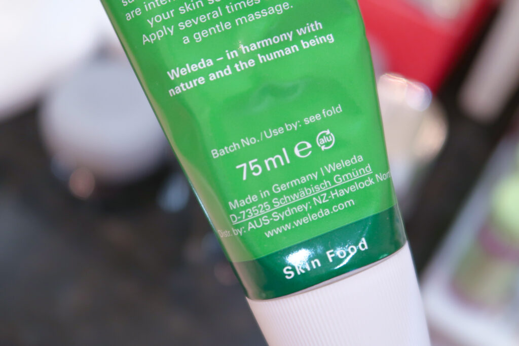
Period After Opening (PAO) – little jar with the lid off, number on side
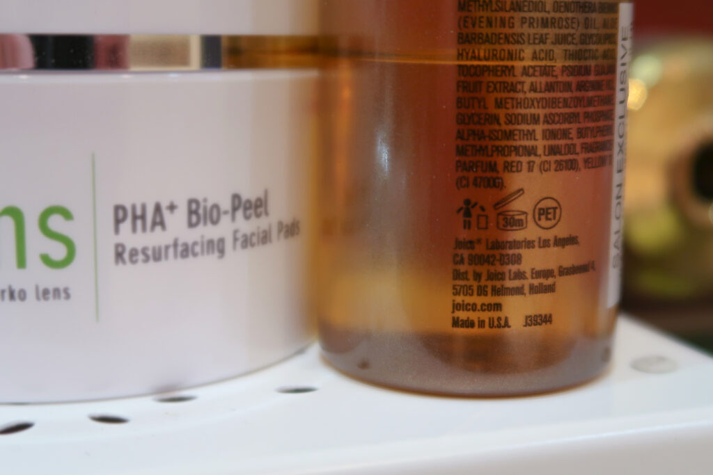
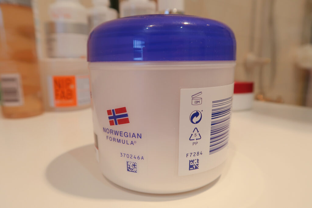
I’m starting with this one because it blew my mind when I first learnt about it. This is something that you will see on almost every beauty product and it’s kind of an alternative to an expiration date. It’s shown by a tiny jar with the lid open and a number and letter inside (or directly next to the jar) which indicates the amount of time after opening that the product is best used within. The letter is usually ‘M’ for months, so a body cream with ‘12M’ is best used within 12 months of opening. Or an eye cream with ‘3M’ should be used within 3 months of opening. The Joico Hair Oil in the photo above has a lifespan of 30 months after I open it.
Best Before End Date – the hourglass
This gives slightly different information to the PAO, the hourglass symbol with a calendar date next to it relates to the shelf life of the product. This means that regardless of whether it has been opened or not, the product should be used before that date. That’s not to say the product will necessarily have ‘gone bad’ after that date, but it could mean that it will no longer perform in the way it was suggested, for example, the active ingredients may no longer be effective after that period of time.
The Green Dot – more like two arrows making a circle, than a ‘dot’ but any who…
Okay, so for clarification, this symbol may indeed appear green but it means the exact same thing if it’s printed in other colours too. It indicates that the creator of the product has made some financial contribution to the recovery and/or the recycling of the packaging. Not to be mistaken for the next symbol, that although similar in appearance, is quite different in meaning.
Mobius Loop – three thick arrows making a triangle, no number in the middle
Represents packaging that can be recycled. Just remember that any remaining contents need to be rinsed or wiped out before you throw it in your recycling bin.
Plastic Coding System – thinner arrows than the Mobius Loop, with a number in the middle of the triangle
This is a reference system for the type of plastic the packaging is made out of, each number corresponds to a different type.
Refer to Insert – hand pointing into a book
This symbol literally means ‘refer to internal instructions’, this could be a leaflet or an informational card inside the packaging and is super common on small products that require more information than they can fit on the packaging. Like with a Vitamin A product where all the usage guidelines, side effect info and the full ingredient list can’t all fit on the tiny tube.
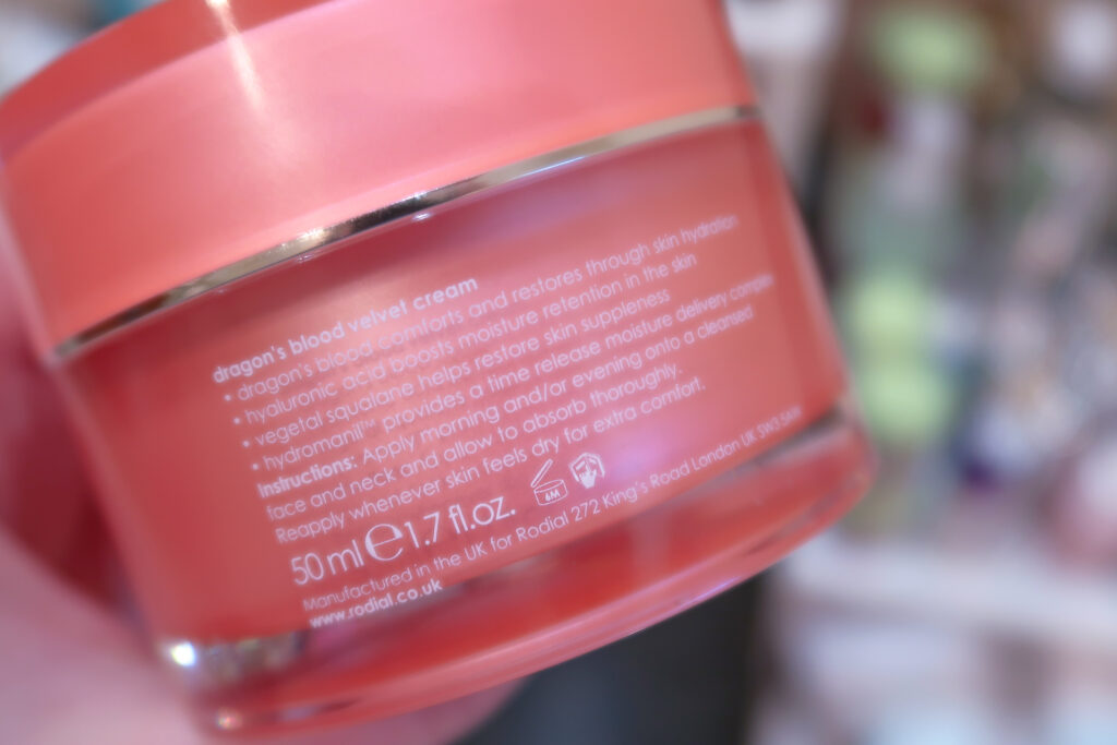
Lowercase ‘e’ – simply the letter ‘e’
This symbol is required by the European Union, but you will often see it on products purchased anywhere. It represents ‘estimation’ which indicates that the average volume of the weight of the product is consistent with the volume listed on the label. You should hope so, right? But apparently, it’s a requirement of the EU.
The Leaping Bunny – literally a jumping rabbit
This symbol is the only internationally recognised logo to denote a product that guarantees to customers that no animals (bunnies or otherwise) were tested on to create the product. Companies may only use this symbol on their packaging after it is independently certified by the CCIC (Coalition for Consumer Information on Cosmetics) that they do not conduct animal testing nor do they use any ingredients that are tested on animals.
Despite all the symbols, dates, and information on the packaging there is one important thing to remember that can’t be shown on packaging and that is to ‘use your senses’. If you’ve been using any product for any period of time and you notice a change in colour, scent, consistency or texture, be cautious. Humid bathrooms, leaving certain products in direct sunlight, or accidentally not closing packaging fully can all result in packaging not lasting the advertised amount of time. So please use the symbol as a guide, but trust your gut… or your eyes/nose in this case.
And finally, if you ever see any kind of growth in your products (eww, I know, but it happens more often than you’d like to think, especially with ‘green’ brands that don’t use preservatives such as parabens) then stop using the product immediately. But always take a photo and send it to the brand, it’s dangerous, and it’s important that they know how their products perform, especially if you haven’t had it for long and have stored it correctly.
How many of these did you know? I guarantee you that you’ll be flipping over the next product you pick up to check the symbols out of curiosity.
Comments (1)
Review: Sunday Riley Tidal Brightening Enzyme Water Cream – steffaniebee
February 10, 2021 at 2:21 pm
[…] Opening symbol – read more about how to understand the symbols on your product packaging HERE) to be a fairly conservative estimate, but with Tidal, it does tend to change texture and scent if […]